- Introduction
- The Creative Process
- Layout and Composition
- Typography
- Photoshop, Illustrator, and InDesign
- Conclusion
- My Conclusion
- References
Introduction
While I do have a background in graphic design, I was always told how important it is to always keep your skills up to date, so you don’t lose them. Even though this is an introductory course, It helped me to remember some of the skills that I have not used for a long time.
When it comes to the definition of graphic design, the instructor for this course, Tony Harmer, provides a great definition (Harmer, 2018)
“Graphic Design is the art of using visual elements, typography, and colour to convey a message.”
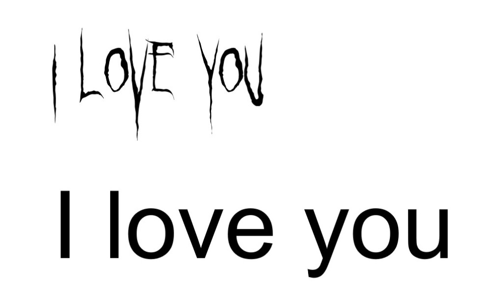
Graphic design, to me, is about creating a message that is visually appealing as well as serves a function to the viewer. So grab your Photoshop layers and your I ❤️ Helvetica mug, and let’s get into the magical world of graphic design!
The Creative Process
The easiest way to explain the creative process is to go through a series of steps to create something new and meaningful. With the creative process, there is a lot of backtracking and repeating steps until you are content with what you have made. You should never be 100% happy with what you have created because if you are pleased, there is no room for growth in your craft, and what you make in the future can be uninspiring. When it comes to design, like with other skills, you want to strive to grow and improve your skills continually.
Tony provides the steps to the creative process, also called design thinking. The steps laid out in the LinkedIn Learning course are as follows:
- The Creative Brief – basically the layout of what the project is, how the project will be done, when the project will be done, etc.
- Research – what you look up and collect to better understand and help you complete the project.
- Ideation – this is the brainstorming step, where you come up with ideas, colours, fonts, etc., for the project.
- Digital Ideation – this is similar to step 3 but in a digital setting using design software. You can also play around with the layouts, fonts, and different colour palettes.
- Production – creating and refining the project.
These steps are rarely followed in a singular direction. Often as you go through the creative process, you will revisit steps as things come up or if things change throughout. When it comes to my personal creative process, it is a little more chaotic than the above five steps, but to each their own, haha.
Layout and Composition
By placing elements in certain quadrants and having those elements at different sizes, you can create a visual guide that shows the viewer what to look at first, second, third, etc., in your design.
One of the most common layouts used is the rule of thirds, which is a 3×3 grid that allows for the placement of elements in a design. The rule of thirds is also used most commonly in photography and videography.

The 6 principles of design that Tony (Harmer, 2018) mentions in the course are as follows.
Typography
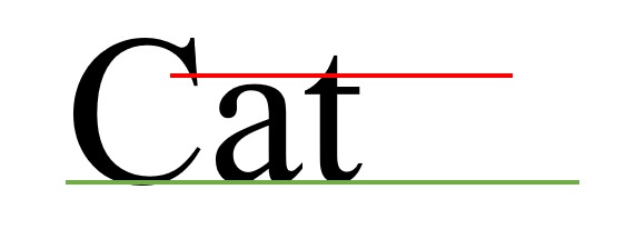
This topic is probably my favourite in all of graphic design. I am very much a font nerd and even have a favourite font, Helvetica. When it comes to font, there are four main components that Tony (Harmer, 2018) lays out. They are:
- Uppercase
- Lowercase
- The x-height (the red line)
- Baseline (the green line)
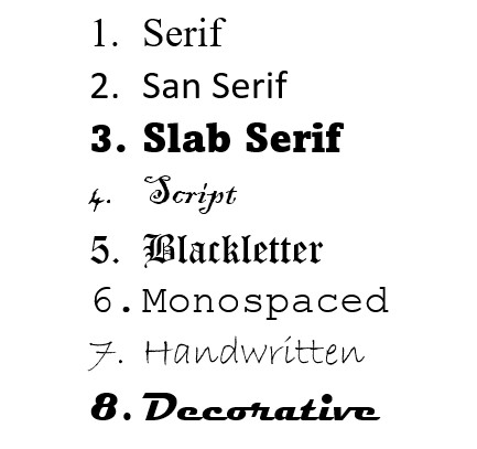
In addition to the components of fonts, Tony includes eight basic type classifications that are from Typekit
Choosing the best font for your project is so important because the font you choose can drastically change the message that you are trying to deliver. You don’t want to accidentally create an unintentional message with the wrong font.
Colour
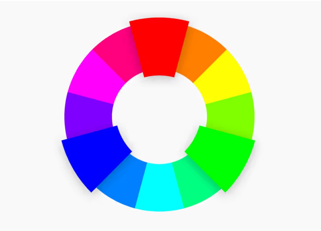
The colour wheel represents the primary (red, blue, yellow), secondary (green, orange, purple), and tertiary (various combinations of primary and secondary) colours. Within these sections of colours, different factors can create even more colour options. These factors are hue, tone, and saturation.
When we speak of monochromatic, we are talking about using various tones and saturation of a single colour in a design. A lot of the time, when we say monochromatic, we automatically think of black and white, but you use this skill with any colour on the colour wheel.


When choosing which colours you are going to use, like fonts, it’s important to choose the best colours to convey your message. With each colour comes a specific association with it, and the association will vary depending on which part of the world you are in. I am going to provide a few associations for each of the primary and secondary colours; I would be interested to hear if you have similar or different associations!
Red – passionate, angry, fiery
Orange – energy, warmth, adventure
Yellow – energy, happiness, lively
Green – health, security, money
Blue – calm, soothing, tranquil
Purple – regal, luxury, power
The next time you look at a poster or a company logo, really pay attention to the colours that are used and see what associations come to mind.
Photoshop, Illustrator, and InDesign
Each of these sections in the LinkedIn Learning course goes over the specifics of each of these programs, and I feel that each program would need its own blog post to cover everything. So instead, I am just going to tell you what each program is used for.
Photoshop is one of the programs that are available through the Adobe Creative Suite. Photoshop is used mainly for creating graphics and adjusting photos. With Photoshop, you can remove specific elements from photographs to use for your design which is super handy.
Illustrator is another program that is available through the Adobe Creative Suite. It is also used for creating graphics as well as logos, infographics, and a multitude of other designs.
InDesign is yet another program that is available through the Adobe Creative Suite. This program is used for laying out your design elements to create a finished, polished design. With elements created in Photoshop and Illustrator, as well as typography elements, you can use the grids in InDesign to layout everything and create a visually appealing design. Some different designs that I have created through InDesign were book covers, posters, and brochures, but there are so many other different designs that you can create.
Conclusion
At the end of this LinkedIn Learning course, Tony (Harmer, 2018) provides a really good list of other courses to look into if you are interested in graphic design. I know I will be taking a look at some of them over the Christmas break!
- Graphic Design Foundations: Typography
- Colour for Design and Art
- Designing with Grids in InDesign
- Learning Print Production
- Graphic Design Tips and Tricks Weekly
- Illustrator CC 2018 Essential Training
- Adobe Mobile Apps for Designers
My Conclusion
For my example for this LinkedIn Learning course, I have a logo that I created for a vintage online clothing store that I work on part-time. The store is called Orbit Retro and Collectables, and it used to be a brick-and-mortar store located on Whyte Avenue. I used the font Magneto which has that 50s retro feel for the main name, and then an easier-to-read font for the information. For the colour, I went with a bright, vibrant pink that was used for the brick-and-mortar store’s banner.
When it came to choosing the image element of the logo, I went through a multitude of sketches that would add to the vintage feel of the logo. I went from a 50s-style pin-up girl to having the O being a stylized planet, and then I ended up going with a retro-style rocket. With the rocket, I went through even more sketches of different shapes and sizes before I settled on one that I felt worked best.
Once I moved to a digital workspace, I worked through the layout of the font, the actual colour of the rocket, as well as the look of the movement of the rocket. I eventually decided to keep the rocket simple with a single colour to help it flow better with the overall look of the logo.
References
Harmer, T. (2018 July, 27). Introduction to Graphic Design [Video]. LinkedIn. https://www.linkedin.com/learning/introduction-to-graphic-design-concepts/introducing-graphic-design?u=2109516
Triadic [Digital image]. (n.d)
https://www.canva.com/colors/color-wheel/

Leave a comment